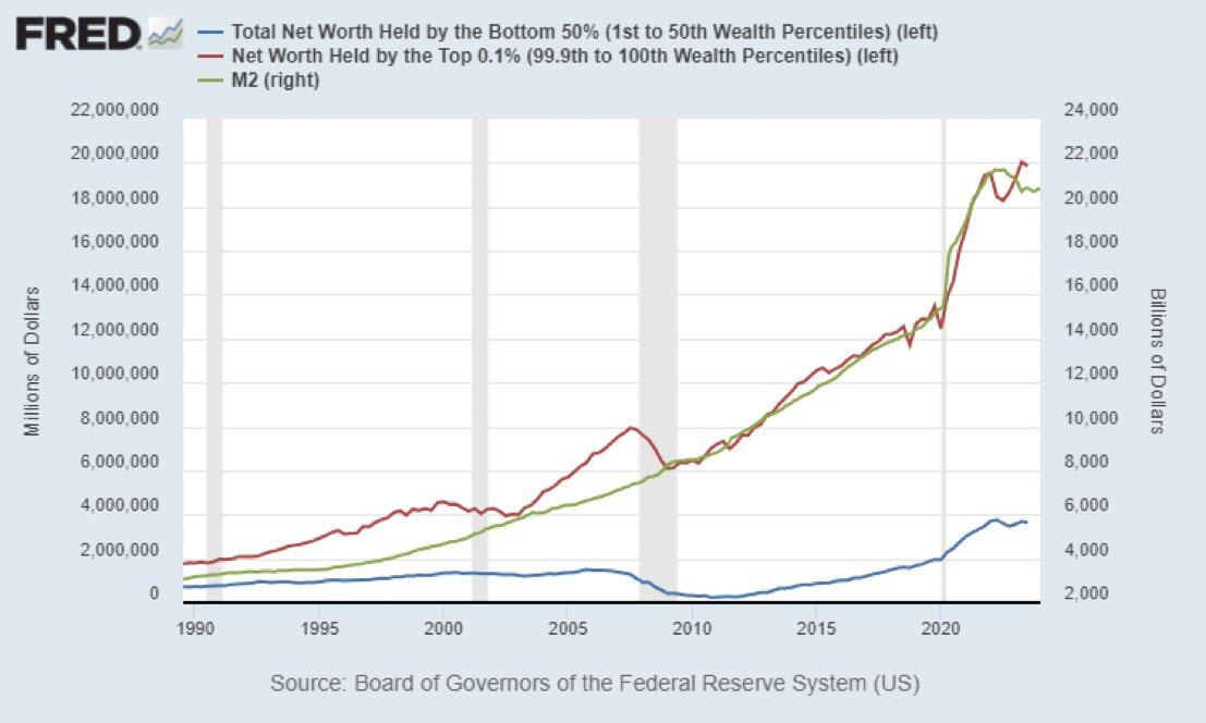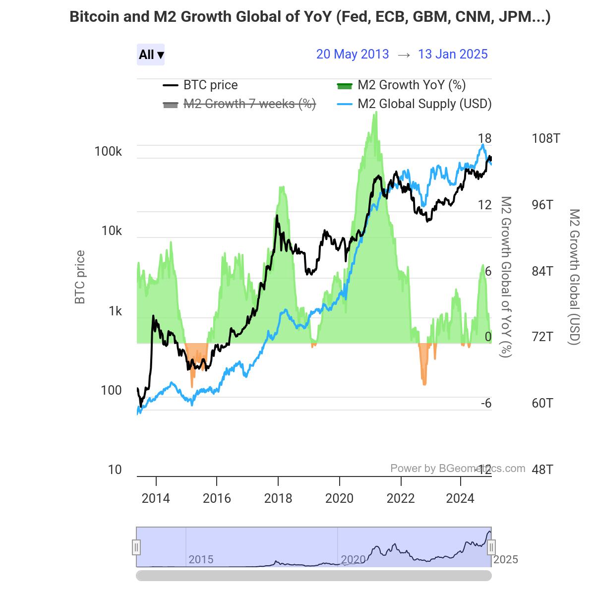
The Cantillon Effect clearly illustrated in a chart.
Money supply (M2) and wealth in the hands of the top 0.1% in the U.S. have gone hand in hand since the 1990s.
Meanwhile, the amount of money in the hands of the bottom 50% remains almost unchanged.
The rich get richer, and the poor get poorer.


